
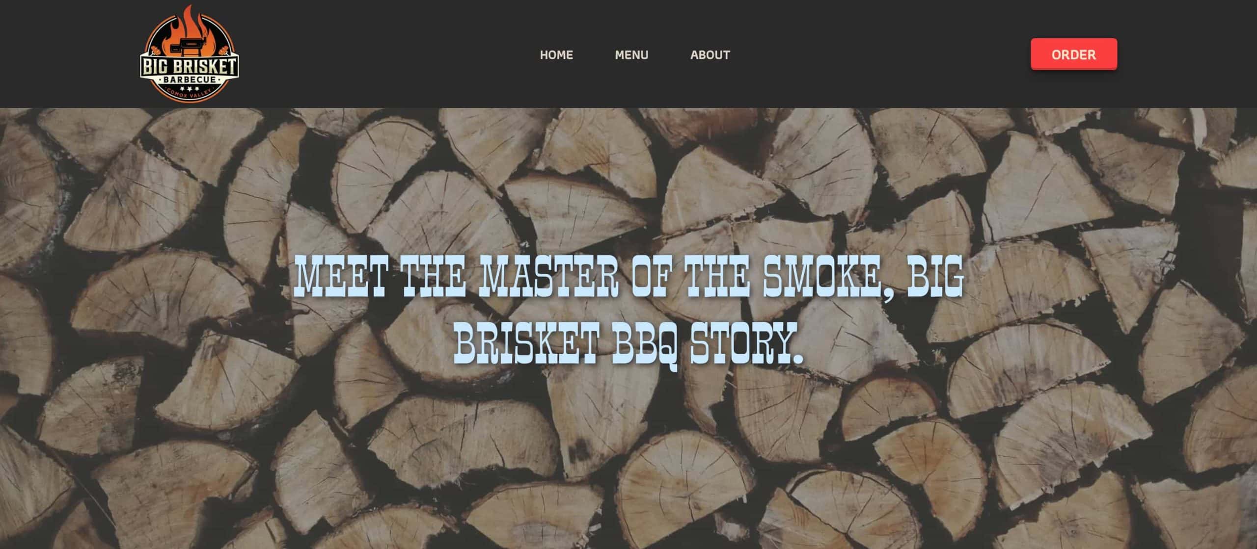
Tasked with redesigning a local small business based in the Comox Valley, I decided to help ol’ BBQ Bill. I chose him solely because I thought he looked like a nice guy and because I can appreciate a good Brisket Poutine. His prices are also very reasonable.
The design began with strategizing a content plan, organizing pages into classified sections and coding all the skeleton HTML to give myself content as foundation. Later, the styles, interactivity and responsiveness were all incorporated with CSS. No ChatGBT code here. I did use AI to help me translate his original site’s information into the tone of Guy Ferrari though. Most images were sourced online at Unpsplash, with a few relatively decent-quality photos taken from the original site.
PARAMETERS
This website was the final project for an introductory course into HTML/CSS. We were offered a large list of Comox Valley local websites to edit and improve based on what we learned both in the best practices of semantics and UI/UX.
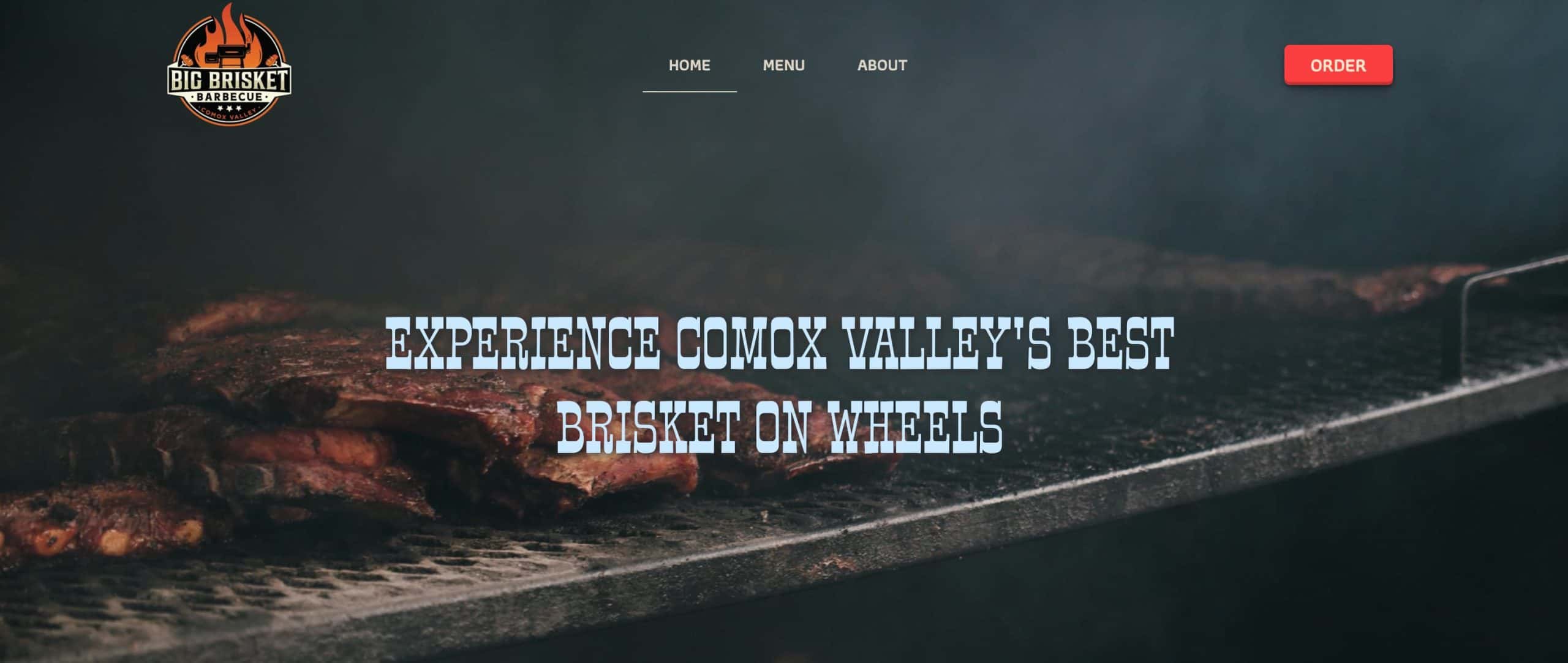
I decided on Big Brisket cause I love me some BBQ and also because I wanted to challenge my inner fairy princess and approach a more masculine, ‘manly’ design.
The initiation phase, you could say, involved reviewing the content on the original site and segmenting the pages and information into logical sections. We took a look at the website performance and noted what the validation errors listed and combined all these improvements into a document which we would use to drive forward our code.
HTML
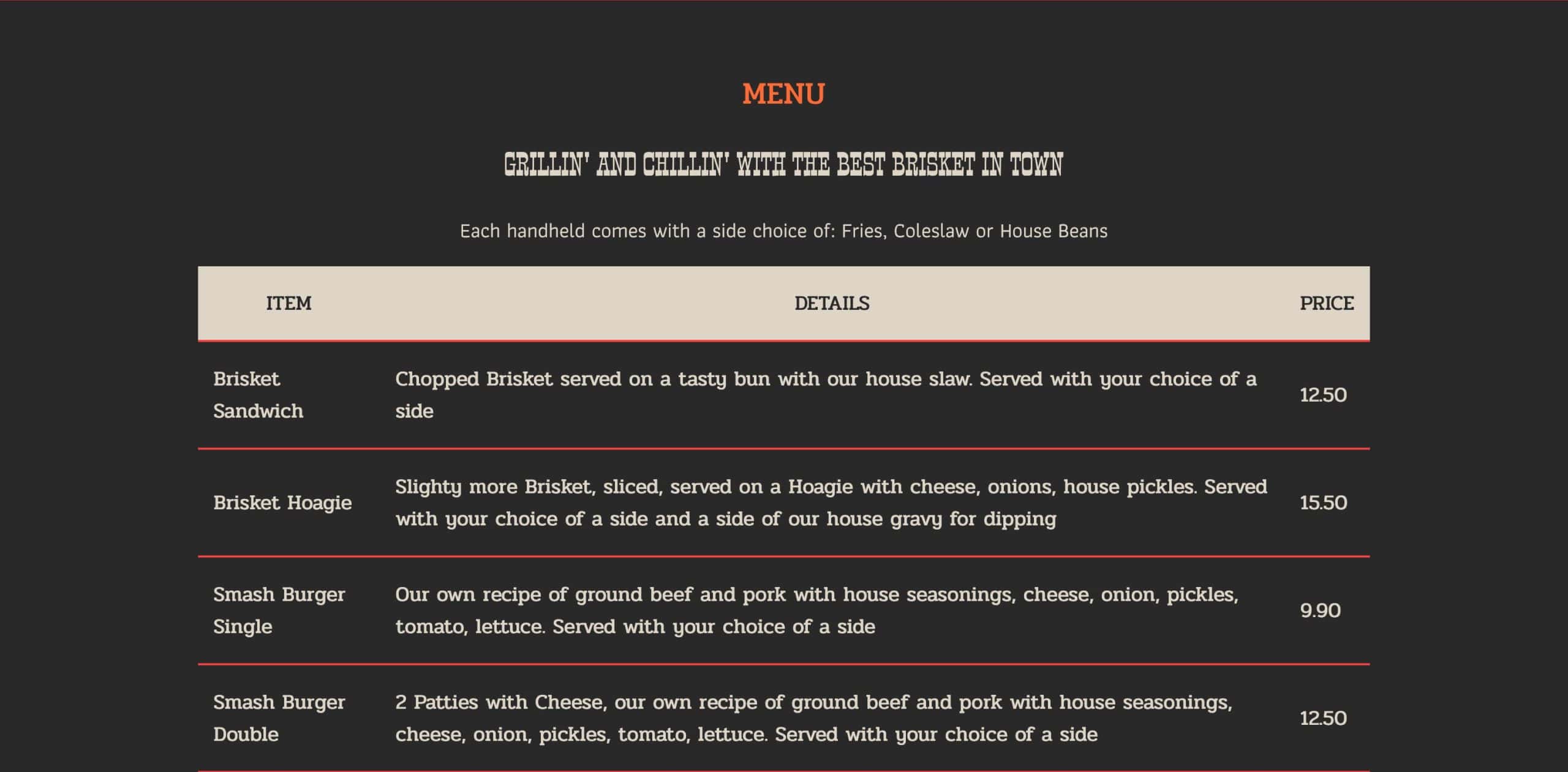
All HTML was broken down according to it’s appropriate sections and semantic structure. We used appropriate tags and groupings to maximize our code and optimize the website’s performance. All fun stuff. Once we had established the very ugly, but practical content onto the page we shifted focus to the styles, the CSS.
There is also instances of repurposed content which populated each page, this was also styled separately in the CSS cascade.
CSS
To make the process faster, consistent and, well, as enjoyable as I could—I created global styles for typographic fonts, weights, sizes, buttons and colour palettes.
Things like buttons would use class names that I could easily apply to the desired content across all my pages.
Beyond global styles, I travelled down the page in a linear fashion, adjusting position and backgrounds to maintain a logical flow to my cascade. I also started with general styles in one foul swoop, then revised with more details, repeating this pattern till perfection. It was a very cyclical process but it was efficient and kept me away from those darn rabbit holes.
Once my main styles where complete, I added my responsive design and voila. Chef’s kiss.