
This is a great example, for myself, that I can look back on 10 years from now and say “Wow. Look how far I’ve come.”. This is was an introduction to multiple softwares, a brief overview of the branding process and learning how to ‘mock it up’.
Yes. You are correct in asking yourself, “Why is there a cougar representing this company?” and better yet, “Why is the logo name not the same as the packaging?”. Well, my friend, we all start somewhere. And my start was confusion blinded by pretty things. Fear not though, for that naivety has dissipated and I may now balance both with equal justice. This is an example of weakness—which every employer wants to see.
THE IDEA
Needless to say, this is one of my early projects for sure. Dare I say, the OG. The one we will keep as a point of reference to look back on feel less bad about ourselves. Well maybe sometimes.
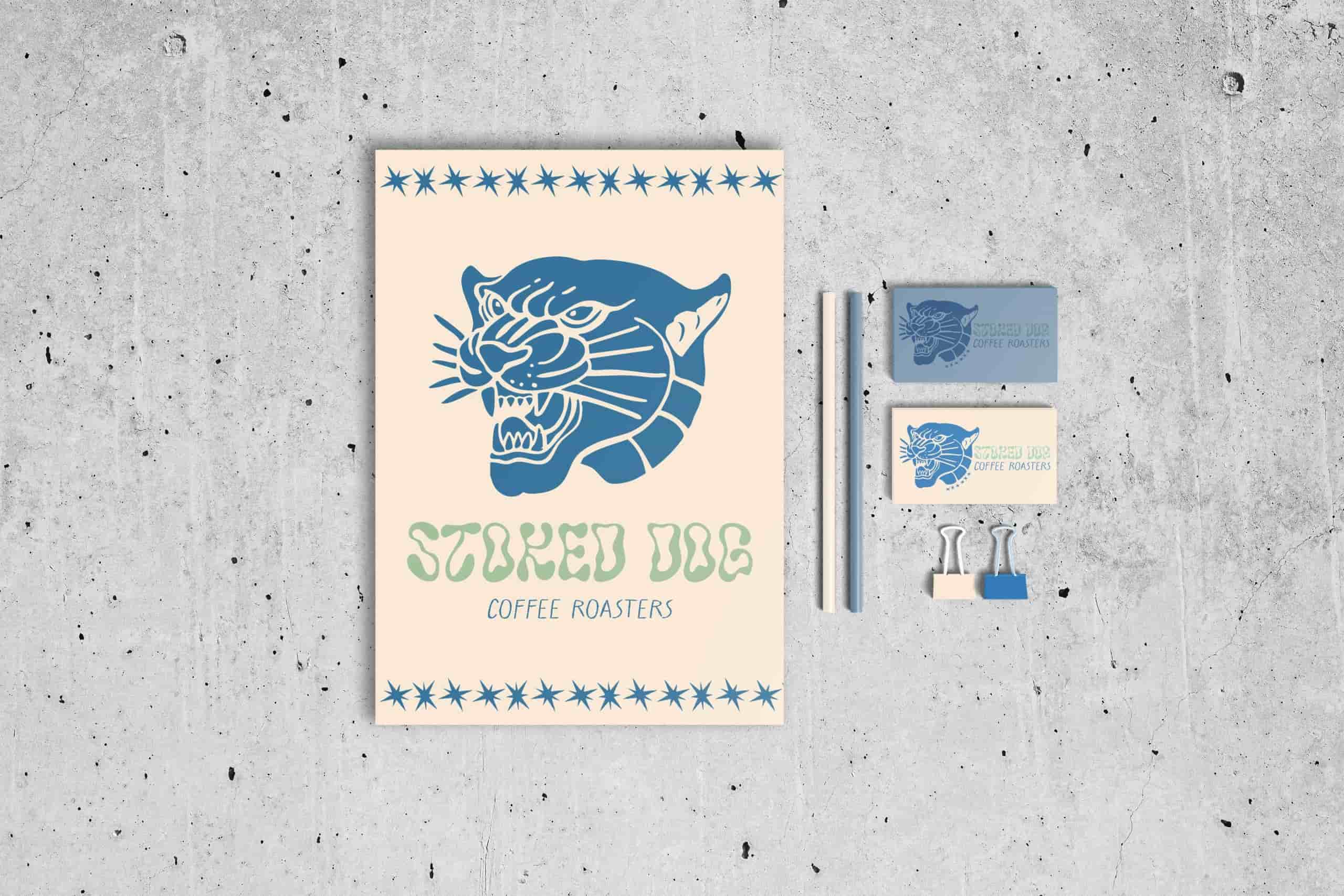
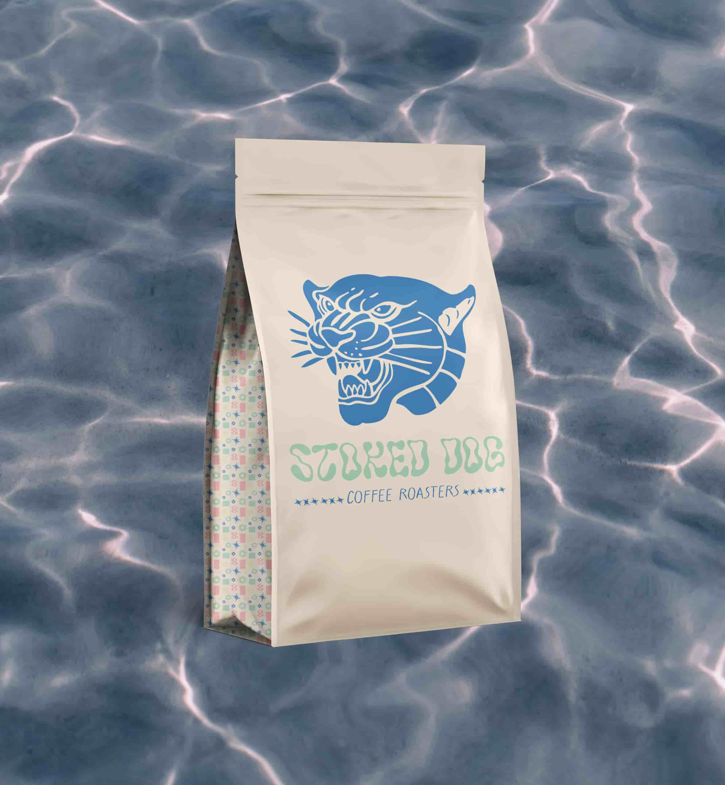
Stoked Dog Coffee Roasters was an experimental case study created in part of a school project that introduced different branding assets, tools and theories to us. We were tasked to create a fictional brand and create everything from the logo, to social media, stationary and product packaging.
I have no words to explain my decisions. But i’ll try my best
THE LOGO
Logo direction is non-existent but it was influenced with a surfy, west-coast cafe vibe. This was primarily created in Canva, as we were being introduced to the in’s & out’s of this of the tool but I did cheat and design the icon in Illustrator. Why a wild cat and not a dog? I do not know. I suppose I was hopping it would create a contrasted, youthful appeal. Something the young and hip would flock to.
The colours were kept in the cooler, pastel blue and green in an effort to create an earthy but lively face for the brand. These are an element I enjoy still.
THE PACKAGING
For our packaging and mock-ups we were tasked with creating additional icons as well as a pattern. These were made using Illustrator and Photoshop. We were equipped with the appropriate mock-up files making the process quick and easy, giving us more time for the designs. I went towards a graphic, illustrative pattern of abstract shapes that best embodied the fruit notes of the roasted bean inside.